Creative Collision Blog

Creative Collision Blog Cross-disciplinary Creativity


Behind Creative Collision


Showing posts with label Graphic Design. Show all posts

Tastes

I found an extraordinary map today. At first it just looks like the London tube map (which is in it's own right famous - even the Congestion Free Network adapted its structure to express their plan)

What this map created by James Wannerton, who has "lexical-gustatory synaesthesia, a condition characterised by the involuntary taste testing of words; it is the conflation of senses that are normally experienced separately." So over 38 years, he has recorded the 'taste' of every place connected to the public transport network of London.


The exercise highlights the value of experiencing a place - when a place becomes so familiar that it has a special place in your psyche (or taste in this case), then there's something cognitive going on. Places are what we make of them, individually as much as collectively, their ambiance adding to the flavour of it.

For more see the Co.Design article. Also remember that the Architecture + Women NZ exhibition is on next week for Architecture Week, make sure you check it out.

Sign


In a block of medium rise buildings in the CBD on Anzac Avenue, I found yet another little food court snugly inside a long narrow shop space and jammed full of various cuisines and different shops. The signage marks this out on the street - they attempt to draw you in.


In Melbourne, the Chinatown was where street signage was the most prominent. A cherry picker was there putting up a new sign. It's as if the heritage building that they were applying it to would change function with it. Such a programme is interchangable as different uses and people are injected into architecture. Same for the Imperial Building (which is talked about in this post about urban connectivity) - the ROXY sign on Fort Lane signals the bar on the rooftop (which apparently might be closed now?), the name Roxy coming from the theatre that used to be in that old building. Architecture is constantly repurposed - churches turn into bathhouses, theatres into rock climbing walls (which is what happened to the Capitol Theatre).


Signage plays a big part in pronouncing new function but also creating a connection with the street. And as we know from the Asian street, it adds to a vibrant bustling atmosphere.

Post-it2

A tweet from New York Times reporter Hiroko Tabuchi caught my eye. It was about a creative process that her husband was going through and tweeting about. Makes me want to have a post-it wall thinking process, too!
See other posts about creative uses of post-its: one of a wall for Mother's Day and another left by a creative barista.

Drive

Many may have noticed the Drive Social billboards up around NZ. My first impression is that it's to combat road rage, if in a very passive approach of doing so. Looks like I'm right - the crux of the concept is that if you know who your fellow drivers are then you will be a better driver.

Bit of a leap there.. high hopes for a billboard-website campaign. The billboards have been pretty uninformative, they didn't really carry all that much of a message until you partake in the lengthy website infographic at http://drivesocial.co.nz/.

Drive social campaign cyclists
Bit of guerilla street art over the large billboard image.

What I find more interesting is what some cycling enthusiasts in Whangarei. A bit of handle bar tape and there you have it: "don't forget about the cyclists!" Someone makes a good point about the campaign too, although the net links us where real world connection are often unlikely it still seems like a round about way to 'be' social:
"It seems that a campaign encouraging you to drive to work in an isolating automobile, then use a computer device to communicate with a human, who is often metres from you, has its heart in the right place, yet is going about things in a very roundabout way."
For a bit of an article about the newly defaced billboard, a form of engagement to the campaign I suppose, see the Northern Advocate article. Thanks to @nzdodo and @kaupapa for tweeting this.

Dirt

Roland Reiner Tiangco's 'Dirt Poster' is only for those who get their hands dirty, a call to action as much as a clever way to communicate a message. 


Can't be more true, in my opinion.

Lady

Here's a bit of pre-Banksy feminist guerilla art, going against the general wave of the times.

Fiat billboard feminist guerilla street art

Cover

What's in a cover? Do you judge a book by its cover? Interestingly Penguin has republished a series of age old classics by George Orwell with some fresh cover design. A great break from the usual staunch classics covers by Penguin, provided by designer David Pearson.


Each is stylistically different, a distilled reflection of the content of the book. A tongue-in-cheek cover of Nineteen Eighty-Four shows the title and author blacked out, a visual reminder of the censorship featured in the dystopic novel. As the designer, Pearson must have had to really understand the book's content as the subject matter.


Animal Farm (read my review of Animal Farm from ages ago) has a blood red background slashed with the title, divorced from the cartoony cover of animals (which was ironic considering the content within) on the first edition of the book I ever read.

What strikes me about these new covers is that you can judge these books by its cover because they are a cheeky static image of the novel. Sure, there's a lot more to the writing than the image, but better than having no feathers on a peacock.

You can see the other covers in this article by Creative Review. And do check out David Pearson's other work - he seems to have quite a connection with Penguin. Thanks again to Alice for providing inspiration.

DMONIC


DMONIC INTENT is an up and coming fashion label, thriving on the enthusiasm and passion of the Woolridge sisters. I paid them a visit at their workspace - a productive conversion of the good ol' garage in Glen Innes.

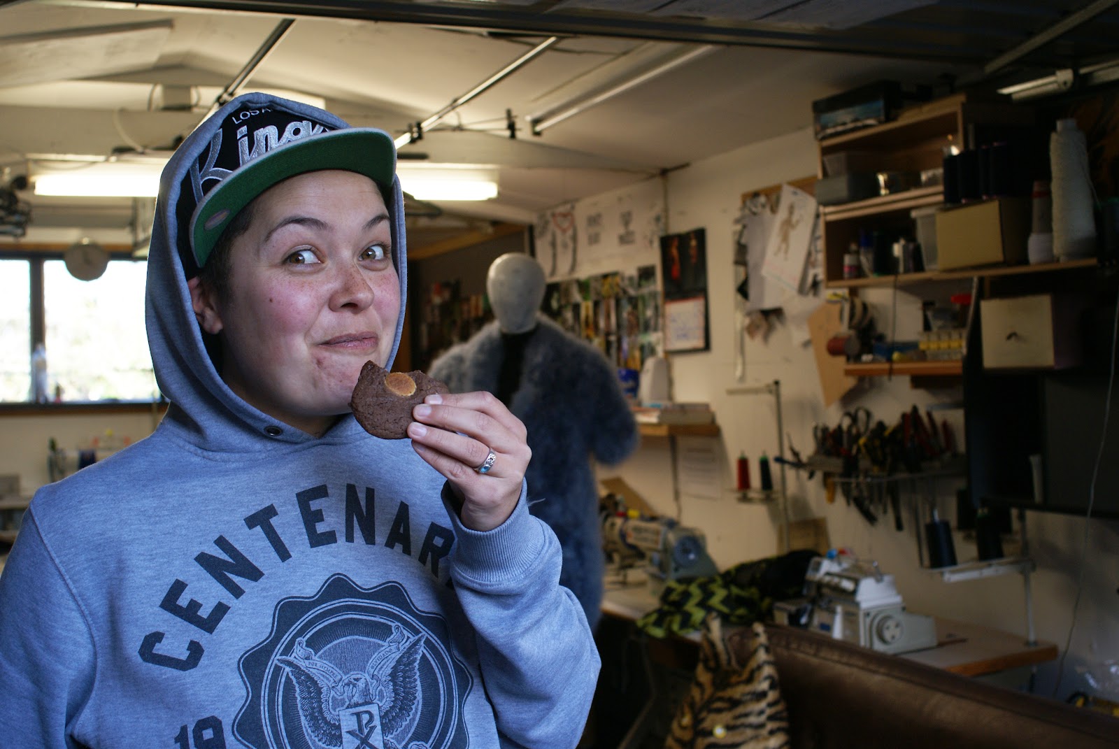
Max, one of the sisters that make up DMONIC INTENT. After having tried many different creative disciplines, she had a eureka moment when she found her sweet spot in fashion.

Creative workspaces have always been a fascination of mine. My own has always been a bit of a dark cave filled with gigantic sheets of paper, chemicals, modelling materials and a shelf crammed full of books. It reflects my creative practice and this can be said for pretty much any creative person.

In this way, the workspace of DMONIC INTENT is full of an interesting mix of tools and inspiration. A Maori whakairo carving stands in the corner, a sentinel of the space. A little jewellery making desk is full of promise but at the moment is intruded with boxes of textiles. On the cutting table, a huge scroll of brown pattern making card unravels potential. Beyond the garage door, their creative community, including their photographer, sits around a table for a cuppa and a chat.


DMONIC INTENT makes more than just clothes. Their stunning jewellery collections are a force to be reckoned with. There is also a graphic design feel mixed into the conceptual drawings tacked on the walls, probably owing to Max's background in graphic design. I love their fun, easy going attitude to their art and how welcoming they were to invite my friend and I to visit.


DMONIC INTENT are due to be featured in the 2012 NZ Fashion Week in the Miromoda and New Generation Shows. Some of their jewellery will also be featured in other shows so look out for them! Check out their work on the DMONIC INTENT Facebook page or follow them on Twitter.


Bombs

What is the first thing that comes to your mind with "poetry bombing"? Sounds a bit dubious to me ever since hearing about poetry jams and grammar slams (......). But in fact, poetry bombing actually carries much more weight.


Planes fly overhead and drop thousands of poetry cards down to the city below. The creative effect of it all resounds with the message of peace by reflecting the imagery of war time air bombings. The project is thanks to the Chilean arts collective Casagrande who did this in Warsaw and most recently a few days ago on London's Southbank.

I think it is an extraordinary way to interact with a good dose of poetry and is a sombre, meaningful action.

Ink


How is ink made? I didn't quite believe a description of this video, that ink making had a very personal touch to it. Were they going to crush up pigment on a stone by hand for industrial purposes? But the mesmerising quality of the process captures something that really makes our printed world the vibrant, textured brilliance that it is today.

A long video, but worth the incredible effort used to make the ink we take for granted. Also check out the blog post about Canon's playful use of ink and sound.

Heart

Some street art on the fence of a rugby venue in Bath in the UK, delineated by the absence of mold.

Just goes to show, no matter where you go, you can't escape the rugby. Since the finals and NZ's victory, the whole thing is being dissected bit by bit, under a microscope with analysis. I feel it's time to move on.

Secrets


Blog community projects are increasingly popular and the anonymity of the net is harbouring the voices of thousands. The Postsecret community is a project of epic, international proportions where anyone can send in their deepest secrets written on self-designed postcards. Often the ones featured are witty manifestations of an individual's darkest, most unspeakable secret.

PostSecret has surely become the much needed sounding board for many and in a fairly creative way. Although text and image are designed, many aren't pretty and graphic design works. Most are jarring to the eye and collide, squeezing vivid text amongst a forceful image. Each make a strong statement, as strong as the person who expels the secret.

Data


Corporates are fast catching onto the idea of using creative mapping and tracking techniques to essentially 'brand' their product. Nike, an innovator of the sports industry, shows us with their GRID programme that technology can act to gather data on the trivialities of life. How far did you run? How fast did you jog? How does this data even get used without seeming silly?

A while ago I tried Nokia's Sports Tracker application which was a bit half baked. Subsequently it closed down. It looks like the technology has now been applied to snowboarding, which is very cool sport in its own right. So data is being used to brand their product, or support the brand. Being able to capture the essence of kinetic energy in creative graphics is a leap in not only the technology, but the way people can read into their own actions and how that affects the way we think about them.

The same way old school branding, such as logo design, a full set of stationery and a colour scheme, can influence the way we perceive an organisation, this method of incorporating the true heartbeat of the people into the branding/campaign goes that much further.

Abandons


With mankind exploring deep into the subterranean opportunities of our planet, there are a lot of cave-like networks that have been made over the course of building out cities and whatnot. And undoubtedly, where ever mankind dwells, waste can be found. One example is the London Underground, and with the adventurous spirit of Urban Ghosts Media, we are allowed a peek into these forbidden and haphazardly preserved environments.

Capturing time through the graphic design of the various posters in the tunnel, we get a sense of how far we have come in that practice of creative advertising. Much of a departure from the glowing billboards and LCDs of today's underground environments, it is uncanny to have such cultural artefacts made redundant so instantly.

For more, visit the Urban Ghosts Media post.