Creative Collision Blog

Creative Collision Blog Cross-disciplinary Creativity


Behind Creative Collision


Bed

Here's a blog post talking about how I did a small project of my own - building a car bed in my Nissan Tiida hatchback for small road trips.

Pro-tip: always reverse into the best view.
Ever since going camping in my friend's Honda Fit - a relatively small hatchback - I started thinking of what I could do with my own car. My workmate also removed the back seats from his van and created a plywood haven with a kitchenette, providing inspiration. Staying in Airbnbs and motels/backpackers can get a bit samey and I've always wanted to give the character-filled camp sites a go without the drama of a tent.

The Honda Fit has the advantage of having the back seats lay down flush with the boot floor, so add a foam mattress and you're sorted. My Nissan Tiida is a different story - the seats laid down are quite a bit higher than the boot so it needs something to raise it up.

The Tiida is longer than it looks and with the front seats pushed as far forward as possible, there is just enough length for me lying down. Anyone shorter should be fine!

The car bed in it's set up state, mattress in. You can see the storage space underneath.
Chuck bags up the front, less used items underneath, the arm rests/door pulls hold our phones. 
Putting my architect skills to good use, I measured it up and started drawing.

Lying down in the car, I could get a sense of how much room I would have to sleep. Headspace is an issue, but it is passable. The simple X-shaped baffle support was the brain child of my fellow architect Han. Highlights the importance of bouncing ideas off others. One of my engineer friends thought up something far too complicated. Go architects!
I ended up purchasing a single sheet of 1.2 x 2.4m plywood (12mm thick) and cutting them into panels. Then a few cut outs and some sanding later, it was all done!

A bit of planning before prefabrication, always best to use material as efficiently as possible. I also made sure the plywood was E0 grade which means that almost has no toxic formaldehyde emissions as we would be cooped up in the car with it.
All it needs is a bit of set up and a thin self-inflating mattress. Unfortunately the head space isn't very much but it's alright as a sleeping platform. Feels like a capsule hotel in Japan. The upside of building it up a platform is that we get storage space inside the baffle construction.

A few details: we made 'curtains' with suction cups to stick to the inside of the windows. For the back seat windows we opened them up a crack for cross ventilation and put mosquito nets over the doors.


None of it is permanent, it's just a few plywood panels that can be removed through the side door. To drive, we just slide the panels on top of each other and slide the front seats back to driving position.

Now we can do weekend road trips easy as!

Backyard

Oakley Creek (Te Auaunga) is one of Auckland’s longest urban streams
It's not often I haven't heard of a place in my own backyard, and the Oakley Creek Waterfall is certainly one of them being only 12 minutes drive from home. I went to investigate and was not disappointed.

It is the only natural waterfall in Central Auckland, and hidden away. It's small and peaceful, but being fairly secluded, it is recommended you go there with a walking buddy. Bring a picnic, it seems to be the way to do it.

There are multiple ways to go onto the walkway and it's all worth a bit of exploring - the signs aren't too helpful. And the typical Auckland question: where do you park?! Google Maps show the track and it depends on where you start from. There are plenty of side streets off Great North Road, some which feed directly into the walkway behind people's houses. You almost feel like you're in their backyard sometimes, for lack of a fence.

A map of it's features, visit the Friends of Oakley Creek website for the full version.
Oakley Creek is like the water spine of the isthmus, going from north Hillsborough near the Manukau Harbour, through Mt Roskill, Waterview (where all the motorway works are occurring) and out to the Waitemata Harbour. Locals may have experienced parts of it, such as the stream running past Mt Roskill Grammar, or the riparian areas in Unitec. Over the years a nice walking track and viewing platform has been constructed to allow better appreciation of this natural habitat, running roughly parallel to Great North Road from the motorway onramp.

Swimming is possible by reports of people jumping in, but I couldn't find any official advice to this. Common sense tells me the stream runs through the length of urban Auckland, so it would accumulate things along the way. Perhaps not swimming there a few days after the rain is advisable which is what we would do at the beaches fringing the city.

The Friends of Oakley Creek (est. 2004) have taken upon themselves to "protect, enhance and restore the ecological health" of the Oakley Creek Environs. They have a map of the walkway, as well as educational events that promote its environment needs. A nice half-day adventure if you're up for it!

Cage

I was struck by inspiration this morning just as I was about to leave the computer for sunnier things (this just after the end of Daylight Savings after all). John Cage and his "Mushroom Book" of 1972 is a collection of drawings and poetry in a folio format. What caught my attention aside from the realistic renderings of fungi was his lithograph prints.


It's as if the mind and its ponderings fell onto a piece of paper, but as a print, these thoughts and manuscripts were purposely prepared then pressured into the paper. Sometimes there would be a map-like drawing to accompany it.


My journals have always been very text based - it's how I process things. Sure there are visual elements, but I'm keen to try this much less ordered (or ordered chaos) approach as a reflection of my own thought process - sometimes muddled, overlapping and reiterative.


For more on the exhibition in New York City, see Hyperallergic.

Britomart


During my last year of architecture school, I used to always walk down to Britomart. It became a place of familiarity as I explored its 'new' form. In spite of the hipster/fashionista/high end vibe of the present, Britomart used to be a backend piece of the CBD. For some, it was the general vicinity of the Oriental Markets, an impression that floats in my childhood memories. For more recent visitors, back a few years Britomart was the site of a lot of carparking.

Today I won't talk so much about the range of eateries and shops around the Britomart Precinct as they have been reviewed and talked about ad infinitum. I focus on the unassuming, but bulk-consuming Westpac Building.

The building lies on the east side of Takutai Square, now a popular seating and events spot. An atrium cuts through the building from the main axis of Britomart, from the train station, through 'pop up' shops to the square.


Last year, I witnessed a transformation of this usually mediocre space into a full blown catwalk, descending from the stair case from the office blocks on either side. It was a range of shows put together for Britomart Fashion Sessions, recruiting most of the labels displayed in the precinct, such as Trelise Cooper, Juliette Hogan, Taylor and Ted Baker.

What I most enjoyed about this was that it was a publicity event that was a collaborative act: the sharing of the space and the prep areas (which no doubt belong to the large corporates that the building houses), the makeup by MAC, the group shows, the City Farmer's Market and bursting-to-full goodie bags. It is really a credit to the organisers for making the whole precinct buzz with their collective presence.

Streetwear show - Timberland, Onitsuka Tiger, Coucou, Neuw Storeroom, Federation


Taylor, Made and Ted Baker


Intensity


Heather Hansen is a New Orleans-based artist who creates incredible geometries using her body on pieces of paper. Part performance art, the symmetrical forms made with her movements allude to the Virtruvian Man in many iterations.


The performance of creating a piece such as this is not completely new – in the 2008 Olympic opening ceremony in China, dancers-cum-artists danced upon a sheet, creating an amazing Chinese-style calligraphy painting whilst maintaining the grace of a dance.


Hansen's work is different in its intensity. The sheer focus given to her work and the piece is reflected in the centrally weighted lines she sits in. Her pose at the end of the piece reminds me of meditation and the spell circles of fantasy novels. 


She doesn't mind getting her hands (or her body) dirty. It's a show of the grit involved in art making, countering the usual sterility of the white, curated gallery. 

Archery


Having finished the main bit of thesis, things are winding down to a bit of a holiday period. That means more blog posts right? Not exactly. The backlash of being so focused on one endeavour for so long leaves a sense of floating in its absence – a tensely strung bow after the arrow is released. So here is a baby post to get me started again.

Recently I came across two architectural projects that had to do with archery. I've always love archery, and someday I'll get down to it and give it ago. But look how it inspired these two projects – one referencing the precision of string, air and direction, the other, a truss embodying the inherent tension of a bow. Both are inspired by archery and nothing to do with the popular culture hype that is going around at the moment (think Hunger Games and the Avengers).

Archery Hall and Boxing Club by FT Architects


The archery hall uses the multiplicity of finely detailed timber members, a motif of fingers grasping the bowstring, ready to release. In its serenity, there is an aggressive gesture as every step falls beneath the vector of a potential arrow. 


In the boxing space, the oriental layered timber language takes a heavier form. As opposed to the expansiveness of the archery hall, the boxing hall is cave-like and oppressive, like a boxer cornering his foe.

Bowstring Truss House by Works Partnership Architecture

Although this building is named after the formalism of the truss, the design captures the airiness of the activity. Expansive light and directionality can be felt in this space as the rafters roughly focus to the inhabited space.

The depth of the roof members help to baffle the light down into the space. Penetrations draw light in, even taking a moment of a glazed box, like a shaft of light.

 -------------------------------------

Sprint


The sprint to the end is always the hardest. This is no different (or, more so) for finishing a thesis. As you can see I haven't been blogging for a while despite the many ideas that spin my way - the task at hand is a big one after all.

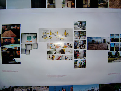
What I will share is my final design presentation (shown above) that just exhibited over the weekend in Parnell. The presentation went well, the design was well received (thank goodness) and the critique was spot on. How it's a matter or funneling that discussion into the written thesis document.

I'll be done in a week, and I'll be back!

Participation

Here's to my 300th post on Creative Collision! Thanks for all of your readership.


The public streamed into the exhibition this weekend, helped by large boat show happening next door. Non-architectural people readily engaged with architectural design with a workshop that was run over two days. In fact, some kids got so into it that they begged their parents to bring them to the second day!

The participatory design system is the brainchild of Tim de Beer, a Master of Architecture (Professional) student at the University of Auckland.

A 3-storey monopitch design by a 7 year old, created all by himself. Each floor is insightfully planned, too.
Architecture Week Auckland participatory design Tim de Beer

Auckland Architecture Week participatory design Tim de Beer


Working with the children and parents into imagining/designing space was an incredible process. It reminds us that a hands on approach to architecture can be so engaging to both clientele and architect.

And that's the end of Architecture Week 2013! For more of what happened see the Architecture + Women Facebook page. Look forward to it next year and for now I'll still be tweeting architectural things on Twitter.

AW2013


It's right in the middle of Architecture Week 2013 and numerous events have been happening in Auckland and, I understand, across the country. The main event is the exhibition at Silo Park (open 9am to 6pm all week and weekend), and the fun opening night that went with it. Even though the weather has been Civil Defence warning worthy in some places, there was a great turnout to the lunchtime panel discussions and last night's discussion at Jasmax.

The exhibition shows a wide range of work including non-architectural work by architectural graduates. As good as Urbis Design Day.

Is Architecture Week merely an inward-looking industry event? It happens every year and is open to all. Yet you don't see the public engaging with architecture and more specifically, architectural design. It doesn't get the attention that other creative industries receive - the international film festivals, art exhibitions, music events and even Taste (I learned today it involves 18 countries worldwide). What is it about Kiwi culture that seems to disregard architecture as a creative profession that is worth getting to know?

Anyone can say this is a pretty model of a building, but very few in the public audience could point out what's good and bad about the design.
Having been to Open House in London and Dublin, I can see how great architectural design can be appreciated by the public who come in swarms to see different buildings and hear about their conception. Open House is an international programme that allows the public to visit buildings that are usually not open to the public. Our version of this? The budding AAA tours that happen on a sporadic basis. If you're not in the architecture industry, you probably didn't even know we have an Auckland Architecture Association. Or not to mention the elusive New Zealand Institute of Architects.

The Longroom at Trinity College Dublin. A huge line of people waiting to be toured around the immaculately designed educational facility. It is completely free. No such large scale event like this in New Zealand.
There are many architects who believe the public do not need to understand or engage with architecture. In some way, people cannot avoid architecture so are already 'engaging', however, there is a lot more that needs to be done in terms of education and a shift in ideology toward architecture to ensure the survival of the profession and good design in our city.

Architecture Week is open for all - this year it is themed Architecture + Women and touch on issues of equality and equity. Do check out their programme and visit some of the events. Next weekend I will be helping with a workshop at Silo Park that lets the public get hands on with discussing housing issues. 

I managed to get onto on of the panels through Kathy Waghorn's Fluid City project, community-engaging architectural installations.