Creative Collision Blog

Creative Collision Blog Cross-disciplinary Creativity


Behind Creative Collision


Showing posts with label Thesis. Show all posts

Archery


Having finished the main bit of thesis, things are winding down to a bit of a holiday period. That means more blog posts right? Not exactly. The backlash of being so focused on one endeavour for so long leaves a sense of floating in its absence – a tensely strung bow after the arrow is released. So here is a baby post to get me started again.

Recently I came across two architectural projects that had to do with archery. I've always love archery, and someday I'll get down to it and give it ago. But look how it inspired these two projects – one referencing the precision of string, air and direction, the other, a truss embodying the inherent tension of a bow. Both are inspired by archery and nothing to do with the popular culture hype that is going around at the moment (think Hunger Games and the Avengers).

Archery Hall and Boxing Club by FT Architects


The archery hall uses the multiplicity of finely detailed timber members, a motif of fingers grasping the bowstring, ready to release. In its serenity, there is an aggressive gesture as every step falls beneath the vector of a potential arrow. 


In the boxing space, the oriental layered timber language takes a heavier form. As opposed to the expansiveness of the archery hall, the boxing hall is cave-like and oppressive, like a boxer cornering his foe.

Bowstring Truss House by Works Partnership Architecture

Although this building is named after the formalism of the truss, the design captures the airiness of the activity. Expansive light and directionality can be felt in this space as the rafters roughly focus to the inhabited space.

The depth of the roof members help to baffle the light down into the space. Penetrations draw light in, even taking a moment of a glazed box, like a shaft of light.

 -------------------------------------

Sprint


The sprint to the end is always the hardest. This is no different (or, more so) for finishing a thesis. As you can see I haven't been blogging for a while despite the many ideas that spin my way - the task at hand is a big one after all.

What I will share is my final design presentation (shown above) that just exhibited over the weekend in Parnell. The presentation went well, the design was well received (thank goodness) and the critique was spot on. How it's a matter or funneling that discussion into the written thesis document.

I'll be done in a week, and I'll be back!

Tastes

I found an extraordinary map today. At first it just looks like the London tube map (which is in it's own right famous - even the Congestion Free Network adapted its structure to express their plan)

What this map created by James Wannerton, who has "lexical-gustatory synaesthesia, a condition characterised by the involuntary taste testing of words; it is the conflation of senses that are normally experienced separately." So over 38 years, he has recorded the 'taste' of every place connected to the public transport network of London.


The exercise highlights the value of experiencing a place - when a place becomes so familiar that it has a special place in your psyche (or taste in this case), then there's something cognitive going on. Places are what we make of them, individually as much as collectively, their ambiance adding to the flavour of it.

For more see the Co.Design article. Also remember that the Architecture + Women NZ exhibition is on next week for Architecture Week, make sure you check it out.

Diversity


Providing for a range of people and their activities is a fundamental part of designing for diversity on an architectural scale. This also happens on an urban scale (around the city) - space is known to inspire diverse users as much as a diverse population for an area creates different spaces.


Using a layered drawing approach, I work between scales, exploring the concept of 'diversity space'. At 1:20 (drawings above), the detail of how one looks at produce in the market spaces, or drinks their coffee in front of their laptop becomes apparent. At 1:100 (pictured below), I can see how people will inhabit the spaces en masse and test whether or not there are a variety of spaces for people to choose to use. This is similar to a blank restaurant space putting out different sizes of tables (or using one small table as a module which can be pieced together).


Sign


In a block of medium rise buildings in the CBD on Anzac Avenue, I found yet another little food court snugly inside a long narrow shop space and jammed full of various cuisines and different shops. The signage marks this out on the street - they attempt to draw you in.


In Melbourne, the Chinatown was where street signage was the most prominent. A cherry picker was there putting up a new sign. It's as if the heritage building that they were applying it to would change function with it. Such a programme is interchangable as different uses and people are injected into architecture. Same for the Imperial Building (which is talked about in this post about urban connectivity) - the ROXY sign on Fort Lane signals the bar on the rooftop (which apparently might be closed now?), the name Roxy coming from the theatre that used to be in that old building. Architecture is constantly repurposed - churches turn into bathhouses, theatres into rock climbing walls (which is what happened to the Capitol Theatre).


Signage plays a big part in pronouncing new function but also creating a connection with the street. And as we know from the Asian street, it adds to a vibrant bustling atmosphere.

Authentic

A building I designed in architecture school in 2008 has proved to be useful in illustrating the points of authenticity and market space for my thesis. Revisiting this project has been quite enjoyable. Here is a brief summary of the project and the issues that it raises and the City Farmers' Market in Britomart that it challenges.

Britomart Farmers Market project (2008)

Challenging authenticity with urban Auckland farmers market
Long section
This project explores the notion of the ‘authentic’ for an urban farmers market in Auckland. The site in 2008 was pre-development Britomart with the site utilized temporarily as an open air car park with a farmers market springing up every Saturday morning. It demonstrates the temporal dimension of urban public space and how its sense of place evolves over time.

Streetview image from 2009 - one of the perks of Google Streetview not updating Auckland for 4+ years. Of course, now the site has become the Country Club, an airy bar full of cigarette smoke and high end consumers.
The crux of the scheme is finding an ‘authentic’ for urban Auckland instead of transplanting the character of a historic or geographically displaced market typology. The scheme is situated in the vacant lot on the southwestern corner of Galway and Gore Street in the Britomart Precinct. The farmers market is designed to bring people in via an ‘exhibitionary pathway’, utilized in retail and museum design to slow down the pace of the viewer. The design worked with the imprinted history of the site, specifically the imprint left by a demolished building on an adjacent building. By bringing market-goers up via an escalator and allowing them to cross the length of the building, the imprint of Auckland’s past is put on display and acknowledged alongside a freely adaptable market of current day wares and produce. In this way, the architecture brings together past and present whilst working for a future condition that Auckland can call its own.

Cross section
This Farmers’ Market project challenges this notion of bringing an authentic quality from elsewhere into an urban context and character. The scheme was designed in 2008 and the site has changed dramatically by the time of writing in 2013. Some things last, however. The City Farmers’ Market that the project drew inspiration and created critique of still exists by popular demand. As in 2008, the website still states that it is an ‘authentic inner-city farmers’ market at the heart of Britomart in Auckland’s CBD’ – an oxymoronic reading between ‘authentic’ and ‘inner city’ as the source of this authenticity is uncertain. In 2008, the market charter had a requirement that stalls provide a piece of hessian sacking as a table cloth in an effort to create a faux ‘authentic’ aesthetic – this has now disappeared from the charter. Although it may help bring cohesiveness to the collection of stalls, there is the problem whereby striving for a character which is not authentic to Auckland to the heart of the Auckland Central Business District denies Auckland from ever building up its own farmers’ market character. Other requirements include using wooden crates and baskets to exhibit produce and limiting the use of plastic.


Aesthetics aside, material is affected and relevant to the architectural expression of this urban space and public place. On one side, Britomart station’s glass louvre extension to the heritage post office building sees the 20th century engage the historic character of Auckland. On the other side, the high end fashion shops and bars are clad in black metallic mesh and other contemporary materials. The controlled manner of conducting the City Farmer’s market is disjointed with the development of Britomart.

What are your experiences with this site and how it has evolved over the years?

Drawing

I've been drawing a section right along my site at Balmoral, showing what I can do with the space and incorporating the lessons I have learned from my research on the Chinese architectural traditions.

Drawing board architecture architect layered drawing
My drawing board, trying to keep a presence to all of the other drawings/content I've created including the drawing of the ancestral house, layered drawings and photo studies.

Photoshop layer drawing Capitol Cinema
This section cuts through the ridge beam and also has prints of old drawings of the striking Capitol Cinema building worked in.

Vibrant

Tiffany Leong architecture thesis project Chinatown
Tiffany Leong's thesis project worked with the Vancouver Chinatown.

Today I happened across (yet another) thesis project about the Chinatown. I've found each thesis I've seen has a different take on the subject and this one is no different. This time it was about Vancouver's Winnipeg Chinatown, one of the largest in North America.
The project came from a 5th generation Chinese Canadian, honouring the memory of the iconic Shanghai Restaurant that her great-grandfather had championed. None of the younger generation wanted to take on the restaurant - there are many cases that I know of here in New Zealand.

Tiffany Leong creates a small scale intervention on the site to the former restaurant. It rises two stories, with a roof inspired by Chinese paper art. It is at the street level that this scheme shows the momentum of the Chinatown condition - a transparency and porosity with the help of pocket doors, louvres and folding partitions. What this does is create human-scale connections that blur the line between public and private. It also draws inspiration from the hidden passages and spaces typical of Chinatowns around the world.

It can be said that Chinatowns were created by the circumstances of the time of formation - Chinatowns are now used very differently from the past. They are less ethnic enclaves (a response to racial discrimination and abuse) and more 'vibrant' communities with a mix of interesting eateries. It can be argued that this typology is not relevant in today's day and age, too. Without a formal Chinatown, Auckland now has pockets of predominantly Chinese areas ('predominantly' because there are many other cultures alongside - Thai, Japanese, Indian, Middle Eastern) and any intervention would have to be inclusive. This may or may not have a role for Chinatown spatial typologies which is why I am not looking only at 'Chinatowns' and their countless examples, but further back drawing inspiration upon the roots of Chinese culture.

Layer


Experimenting with my transparent butter paper sketches and bringing them into the 3D. Good bases for modelling off. You can see the ancestral altar sitting on one of the top tier near the ridge beam condition - I've yet to determine the nature of this ridge beam and its raising.


I've drawn different conditions: screening, rising, semi-private, alcoves. I'll have to sort out a strategy for arranging these conditions and spaces. I have some ideas of an axis moving through in spreading out vertically into these different spaces.

Ridge

Drawing ridge beam detail Chinese hall

At the moment, I'm focusing on the ridge beam and its importance in the tradition Chinese house. The book Yin Yu Tang states that the beam is more symbolic than structural. How can this be so when it is the highest building member of the frame? There is a saying in Chinese - äžŠæ¢äžæ­£äž‹æ¢æ­ª, which, in true Asian style, summarises the following in 7 thoughtful characters: if the ridge beam is crooked, then the lower members will also be crooked. This describes the Chinese house as the family within it - the association is so powerful that it is almost metaphor, just as one family member is not only themselves (as is in the individualistic Western cultures) but their whole family collective.

A real flower ball complete with a tassel.

There is also a ceremony for raising this beam. In the traditional close-knit village, everyone would be invited around for a feast and a red 'flower ball' would be attached to the ridge beam, which would sometimes be painted red. They would also perform the ritual of paying respects to the ancestors with an altar, sticks of incense, and offerings of food. A similar ceremony takes place when the site is selected too, the purpose to have the ancestors overseeing the process and imbuing the communal happiness into the house even from the early stages.

architectural model flower ball Chinese ceremony
Imposing this importance on the Balmoral site model, marking its being in the space. Also did studies of seeing it from the street above the silhouette of facades.

As I started drawing the ridge beam detail of my ancestral hall, I noticed most of it had corroded with age. Very little of the relief sculptures could be made out. So how would I find out what the symbolism was? To me, it isn't really all that important to know exactly what the symbolism is. The usual symbols can be expected of course: dragons (energy/power), phoenix (longevity, renewal), various fruits and flowers (fertility, to have sons). There's also plenty of symbolism underneath the roofline, protected by its shadow. In a way it gives me the space to create my own symbolism on this beam for my architecture - one that talks of Chinese here in Aotearoa as a shared land.

Connection

With the gap between the Capitol Cinema and the buildings on the north side, there is an opportunity to connect the mainstreet (Dominion Road) with the back street (the service lane/multiuse space between Balmoral shops and behind the Warehouse). Furthermore, there is a potential connection from the backstreet across to the Warehouse carpark, perhaps activating that space.

A further cross connection such as this one increases flow through layers of Balmoral, instead of depending on vehicle trodden routes which move around blocks. Good examples of these small but effective connections are Fearon Hay's Imperial Lane and the path inside of RTA Studio's Ironbank Building on Karangahape Road.

Fearon Hay's Imperial Lane between Queen Street Fort Lane Auckland
Within Imperial Lane, a slight bend in the axis from Fort Lane (front) to Queen Street  (lighted path in the back right).  A slight slope up to the central area creates a sense of elevation and arrival as a threshold to Fort Lane. The entrance at Queen Street, on the other hand, is camouflaged among the other street frontages.
In Imperial Lane, the space between the historic Queen Street buildings are converted into a commercial/eatery/office spaces with contemporary materials working in the same language as the industrial past of the original shell. Connecting Queen Street (importantly the downtown area) and Imperial Lane which, before the streetscape renovation, was a dumpy back alley with unpleasant smells (still has some today I suppose), Imperial Lane's connection breaks up the large block into more pedestrian friendly paths to Fort Lane, Customs Street and Fort Street - a new network beneficial for the area that breaks away from the straight street edge typology typical of Queen Street and Balmoral Shops.
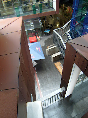
The connection within RTA Studio Ironbank building K Road Auckland
At the Ironbank, the path access from K Road to Cross Street bends around approviding approaches to the internal courtyard (activated by beanbags and the umbrellas) creating a multi-axial and inhabitable semi-public space.
The Iron Bank on the other hand does not bore through an existing fabric. Within the building complex itself, a pedestrian pathway was formed, connecting K Road with Cross Street around the back. Interestingly the path is not a straight one - this also decreases the likelihood of the lane becoming a wind tunnel (although first hand experience shows that there is a bit of a problem with this).

A common trait between these examples is that there is a bend in the connecting street and through route is activated with different uses - beanbags, tables and chairs, game machines. The space between Dominion Road and the Warehouse carpark has a bend also, which provides micro-climate protection (i.e. against wind tunnels) and possibilities for an interesting activated space.

I had a bit of a conversation on Twitter about these urban connections with @citysituated, an urban planner, just within the fleeting dialogue we had recalled a bunch of great examples where small scale connectivity in the city helps create vibrant pedestrian networks. Airbridges at PWC, Takutai Square, Cross Street, connecting arcades in Queens Arcade, Midcity... all to varying degrees of success.

Model1

Balmoral shops heritage model architecture
Site model of a part of Balmoral, focusing on the back area behind Capitol Cinema and Warehouse building. Warehouse and rear buildings not in yet. 1 : 200 scale. 
Even with this partially completed site model, the typology of buildings next to the intersection at Balmoral can be seen. The straight edge frontage on Dominion Road, the joined shops all stretching back to various degrees. The largest building at Balmoral shops is the Capitol Cinema, the large one in the centre. Off to the extreme left, the row of shops end to the landscaped corner of the large Balmoral-Dominion Road intersection opposite Potter's Park.

Back view of Capitol Cinema Ngaire Chambers Warehouse Balmoral
Around the back, the staggered formation of buildings and for some of them, their patched together nature, can be felt. Admittedly, there are yet more little shacks attached to the ends of some of the second storey levels and in real life, cars fill up most of the indented spaces.
Street facade model of Balmoral shops
To the right hand side of the Capitol Cinema, a tiny shop was plugged in between  the heritage cinema and the Ngaire Chambers (modeled with its facade siloheutte). To the left of the cinema, there is a space like an alleyway closed off from the street with a poster ridden gate. I've left it open, perhaps a way for me to establish a connection between these interesting back spaces and the mainstreet. It also has a vertical nature.
The Unitary Plan lists Balmoral as one of the 'historic character – business’ zones. In light of future intensification, the local centre zoning also allows for up to four storeys (currently most are two storey, Capitol may be considered three) with residential units allowed on the top stories (which is what Balmoral has already). Great opportunities with the air space around these buildings but need to keep thinking about the 'historic character' of the architecture that makes Balmoral so urban and distinctive.

In terms of memory (one of the main themes of my thesis), a friend commented in studio that he knows that space between Capitol and Warehouse very well... apparently he goes there to get cardboard boxes! For others, this space is their home street, you can see by the amount of colourful laundry hanging on stair railings.

I'll be posting more about this model as it evolves - eventually I'll be adding some designed elements to it to explore what could happen in this space. I'm also looking forward to the Taniwha and Chinese Festival next Saturday (27th April) which will see a pōwhiri between Maori and Chinese. Thanks @NZBC88 for the heads up.

Balmoral

Balmoral, Auckland has some great hidden spaces around its heritage architecture.

Capitol Cinema Balmoral drawings
Capitol Cinema

Although humble in scale and ornament, Balmoral contains a whole heap of heritage architecture that speaks of a semi-urban condition. Most of the buildings are 2 storey with residential uses often on top. In recent times there are some which have become commercial too, with doors leading up a long flight of stairs to some great eateries (eg Gogo Music Cafe, My Kitchen)

Ngaire Chambers heritage architecture Balmoral
Ngaire Chambers

Balmoral maintains a strong flat frontage to Dominion Road. A part of its character, but it also leaves little room for variety or on street usage. The heritage front is accompanied by a rather messy feeling, haphazard back end - there are strong service lanes on both sides of Dominion Road with some very interesting spaces.

The buildings have changed from use to use over the years - the most valued heritage building, the Capitol Cinema, went from a theatre to what is now part theatre, part climbing wall and mah-jong hall, to name a few. The service lane doubles as a residential mini-street with laundry hanging, people meeting and talking. The Warehouse orientates itself to utilise the service lane too, making a more Asian street feeling, multipurpose space than the mainstreet. I've no doubt I'll be making use of these spaces in my project as much as the street front.

Behind the row of shops, a condition very different from the street front.

Concept

Milestone - Concept Crit

Yesterday was the first public showing of the theses, the concept crit. Chiefly to convey the main idea and the project within that idea, it was a brief encounter with critics that can give a real impression of what the thesis means to other people.

China Chinese Ancestral House Thesis Architecture
Drawing of my great-grandfather's house in section (cut in half)
Thankfully after my rather haphazard presentation (need more clarity in what my points are - hard because I'm still not entirely convinced as to what they are), one of the critics picked up on exactly what I had in mind. Taking the essence of Chinese culture into the existing streetscape at Balmoral, utilising the backstreets and making connections where they might not exist. Something about that communal street architecture is exciting and has relevance to the way Balmoral has developed traditionally.

Balmoral is a different playing field now. The project isn't about erasing the past (including the charming heritage feel of Balmoral), but working into the existing fabric of the street to enliven it - better moments throughout the space. If you look at it now, it's rather linear: strip median, road, kerb footpath, shopfronts for miles.


So let me know if you know of any interesting spaces in Balmoral, around, at the back of, within buildings!

Memory

Drawing from memory - my ancestral house.  Fine brick work and tiling, simple but considered spaces and thresholds.


Genesis

Architecture thesis topic critical question painting

Thesis topic
Beckoning to the Homeland: Drawing upon Chinese Roots in the Auckland Context.

Critical question
What significance has architectural examples that 'beckon to the homeland' have to Chinese (particularly their ancestral roots - the commonality of all Chinese) in Auckland?


Where did this thesis topic come from? Initially it was my curiosity of my family's ancestral roots which drove me to think about these issues. Then I did a two design papers about culture in an architectural standpoint and realised that it is a rich thing to explore. The topic still needs more clarity and as I work more on it and critically think about what I want to focus on, I think it will become a lot more 'doable'.

Have you ever thought about your own roots? Which is the earliest ancestor you know of? Where did you ancestors come from? What rituals/traditions have been retained from their time up until today as you continue practicing them? This thesis raises these issues whilst working on it - the crux of it is, what is the role of this 'culture' here in Auckland, the multicultural mixing pot?

With increasing emphasis put on the multicultural (including within legislation), and various manifestations of different cultures around the city, there is still very little on why it happened and where it could develop as a public space - a communal space. 

Thesis


Some of you may know that I'm doing a Master of Architecture (prof) degree at the University of Auckland. As this year is my final year, I'll be preparing a design thesis - this is basically partly a written thesis (although not as intense or comprehensive as a PhD thesis) and an architectural design project. The latter involves designing a building based on your research and researching by designing.

And so it begins, the final push before actually starting a career in architecture. Some of my fellow thesis people are starting blogs about their thesis work. Although I'm not sure what the intention is (my supervisor and I had a bit of a discussion about this), blogging and the creative process is a very compatible thing. That we have to write as well as create makes it all the more a union. Often blogging is underutilised or, even more sadly, ditched before the water is deep.

Considering the prospect myself, I thought 'hey, I already have a successful blog with lots of readership and a plethora of creative gems from years and years of collecting!' So I thought I'd record my thesis blog on Creative Collision as a way of keeping it up and processing my thoughts. I did also consider just writing a post which said, 'hey guys, see you next year when I finish my thesis and recover from the subsequent implosion.'

Blogging about your creative process is one of the most personal things a creative person can do. Not to mention my thesis is of a very personal topic - exploring my family's roots and Chinese culture in the Auckland context. It is so exposing and you need determination to get through putting things that is happening onto the public realm. Basically, you need balls of steel. Particularly if you get "constructive criticism".

I do invite you to comment on what I am doing and I'll try my best to make it palatable for a wider audience. By the end of the year, hopefully things will have gone swimmingly.

I've created a new label 'Thesis' to keep the thesis posts marked. They will be about creative things and hopefully in line with the rest of the blog. There is also the option to subscribe on the left hand bar (just enter your email address). More pretty pictures to come.